This is a fun little story whichs shows while I still use a Pebble smartwatch 5 years after the company shut down.
In 2018 my Mum moved to the Isle of Wight where she grew up. It’s an small island off the south coast of the larger island where I live.
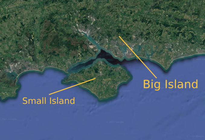
The island has a really interesting history to it, and is a place I enjoy visiting. One of my favourite bits of history the island is tied up with is Operation Pluto, the WWII operation used to deliver fuel to the allies during D-day. Not to be confused with Project Pluto, which is an infinitely more horrifying concept.
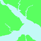
Anyway, the only way to get to the Island by car is to take a ferry. There are 3 routes operated by two companies, and it’s here where this fun little JS project begins. For when I was buying tickets the other day, I noticed a realtime map on the company’s website:
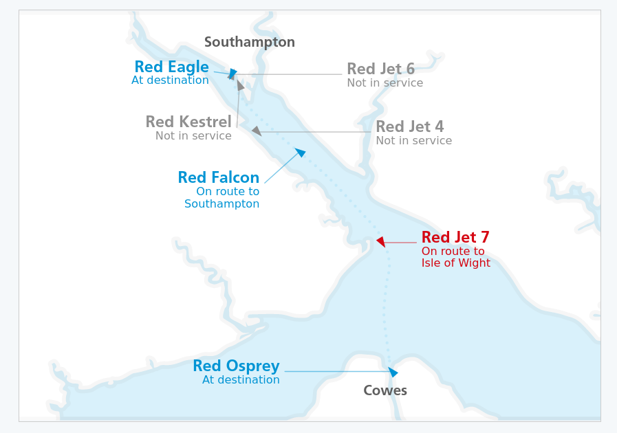
The red arrows are the foot passenger catamarans, and the blue arrows the car ferries. I thought this was neat so naturally I started to poke it to see how it works.
My old friend Jason
Much to my delight, I found the ship data is returned from an API in simple-to-parse JSON array, with each boat represented as an object like so:
{
    "id": "JET7",
    "class": "high-speed",
    "marker": {
        "position": {
        "x": 1097,
        "y": 675
     },
    "rotation": 156
    },
    "connector": {
        "from": {
            "x": 1097,
            "y": 675
        },
        "to": {
            "x": 1170,
            "y": 675
        }
    },
    "label": {
        "position": {
            "x": 1180,
            "y": 675
        },
        "textAnchor": "start",
        "name": "Red Jet 7",
        "info": [
            "On route to",
            "Isle of Wight"
        ]
    }
}
At this point I started to think what I could do with this data. I could’ve made my own dashboard with it, but that isn’t too interesting as it already exists. Instead I decided to make it into a Pebble smartwatch app.
Making a map
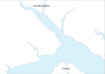
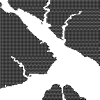
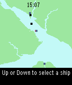
Before I started writing the code for the watch, I had to think about how this would work. First I’d need to recreate the map from the website on the watch. To do this I took a screenshot of the website’s map and painted out the markers and text, then I shrunk it and cropped it until it would fit on a Pebble. The Pebble screen is only 144x168, so it’s not much space to work with. Finally I created a coloured version for the Pebbles with colour, and a dithered version for monochrome models using ‘Floyd Steinburg’ dithering.
 ↓
↓
 ↓
↓
 +
+
(Because of the transflective LCD the coloured Pebbles have, the colour image looks nowhere near as gaudy irl)
Translating the ships
The API returns the X and Y positions of the ships relative to the map on the webpage. Through some trial and error using firefox’s developer tools, I was able to work out that the map on the website was 1530 x 800. However weirdly the leftmost visible portion was at +400. These values will be hardcoded into the watchapps’s code, so that for any given X&Y co-ordinate I can work out the relative position, and then work out where the ship should be on my much tiner map.
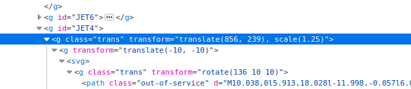
The translate() function in the HTML contains the X and Y position. Increasing these until the ship was off the map let me work out the upper bounds.
One thing I didn’t think about initally here was that for this to work my tiny map needs to be the same aspect ratio as the original. Initally I cropped the map to 144x168 and of course this didn’t work. To fix it I just made the watch’s map 144x144, with a status bar displaying the label values taking up the rest of the vertical screen space.
Now I was almost ready to start writing watchapp code. First I wrote a function that accepts and X or Y position from the API and returns the equivilent position for my smaller map
function getScalePosSingle(pos, xy) {
	var og = env.ogMap.y
	var max = 144
	if (xy == "x") {
        //The 125 comes from the cropping of the width of the map we did
            og = env.ogMap.x + 125
	}
	var newpos = Math.ceil((pos / og) * max);
}
Because I cropped the sides of my map, I have to add 125 to the X position to make sure the ships are in the right place on the map
Draw the rest of the owl
There are two ways to write apps for the Pebble smartwatch, in C or Javascript. While C is more performant and generally preferred, I only know Javascript. Plus writing apps in JS is much faster - This whole endevour only took a lunchtime and a half over two days. I wont go through the app’s code here, but essentially the following takes place
- Init the app and create a background image, as well as the status bar rectangle at the bottom, a status text box, and a little marker we’ll use later to show what ship we’re displaying the status for
- Create an empty javascript object to cache ship data in
- Call the Red Funnel API
- For each ship in the response, create a new image if it’s not in the cache and set it to the right colour (if on a colour watch)
- Use the API data to calculate the X,Y of the image and use element.animate() to move the ships there with a nice animation
- Call the API every 20 seconds to update the ship positions
If you want to take a look at the code, it’s on Github. The magic happens in src/js/app.js
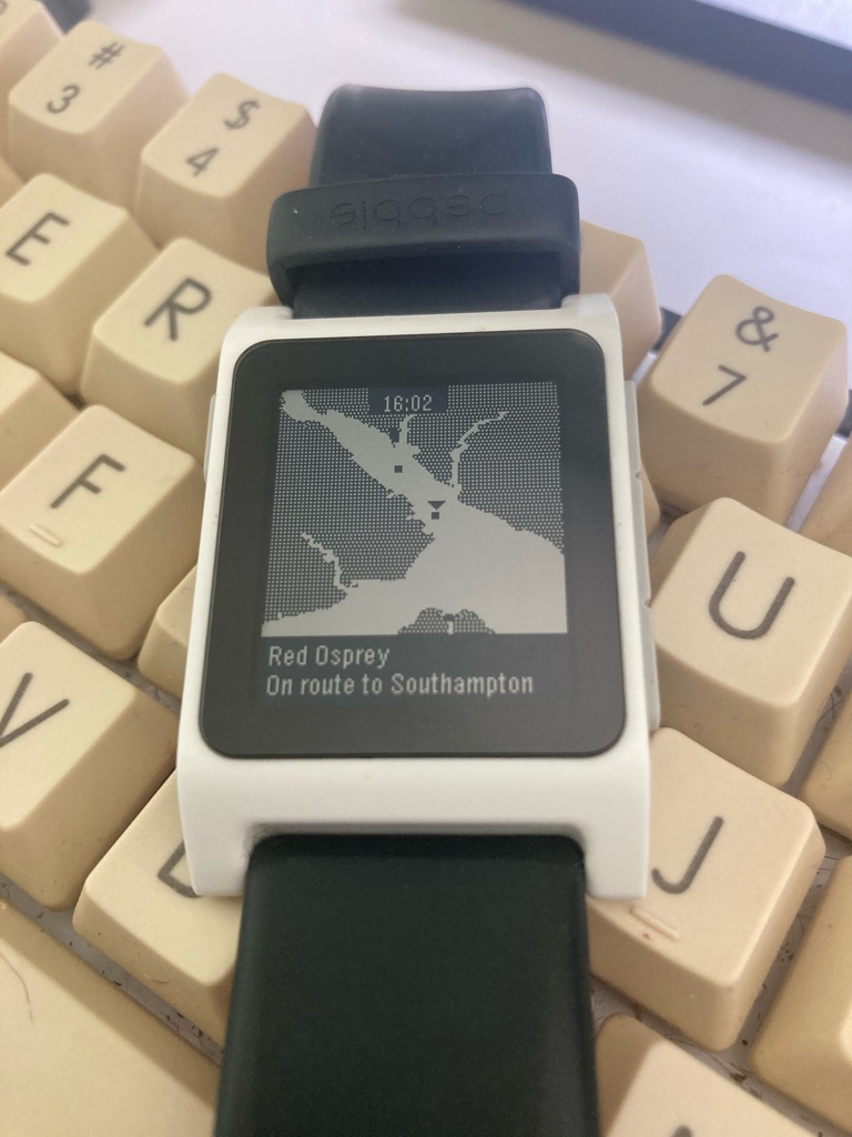
It looks something like this:
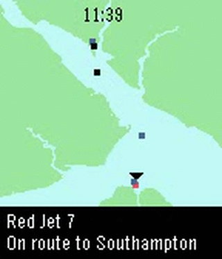
I then added some logic to let you press up or down to cycle through the ships, which displays their status in the bar at the bottom. It also moves a cursor above the ship so you know which is which. Finally, I made it so when the status changes for a ship (i.e. it arrives in port), the watch vibrates.
Here’s a timelapse of Red Jet 7 travelling from the Island to the Mainland.
Lunchtime well spent
This was a fun little project that I look forward to using in a few weeks when I take the ferry over to the Island. If you’re from Red Funnel I hope this is okay - I actually read all the terms and conditions on the website to check! Ironically I wanted to roll my own data caching server so if the watchapp suddenly got loads of users (for some reason) it wouldn’t affect their servers, but they forbid rehosting or retransmissing their data.
It’s things like these which keep my using my Pebble years after the company shut down. Being able to whip this up in sub 2 hours with ~200 lines of Javascript is fantastic, it probably took me just as long to write this post about doing it!
I need to clean my keyboard again.